Scroll to explore
01 / 08
BanglaChain
Brand identity
Description
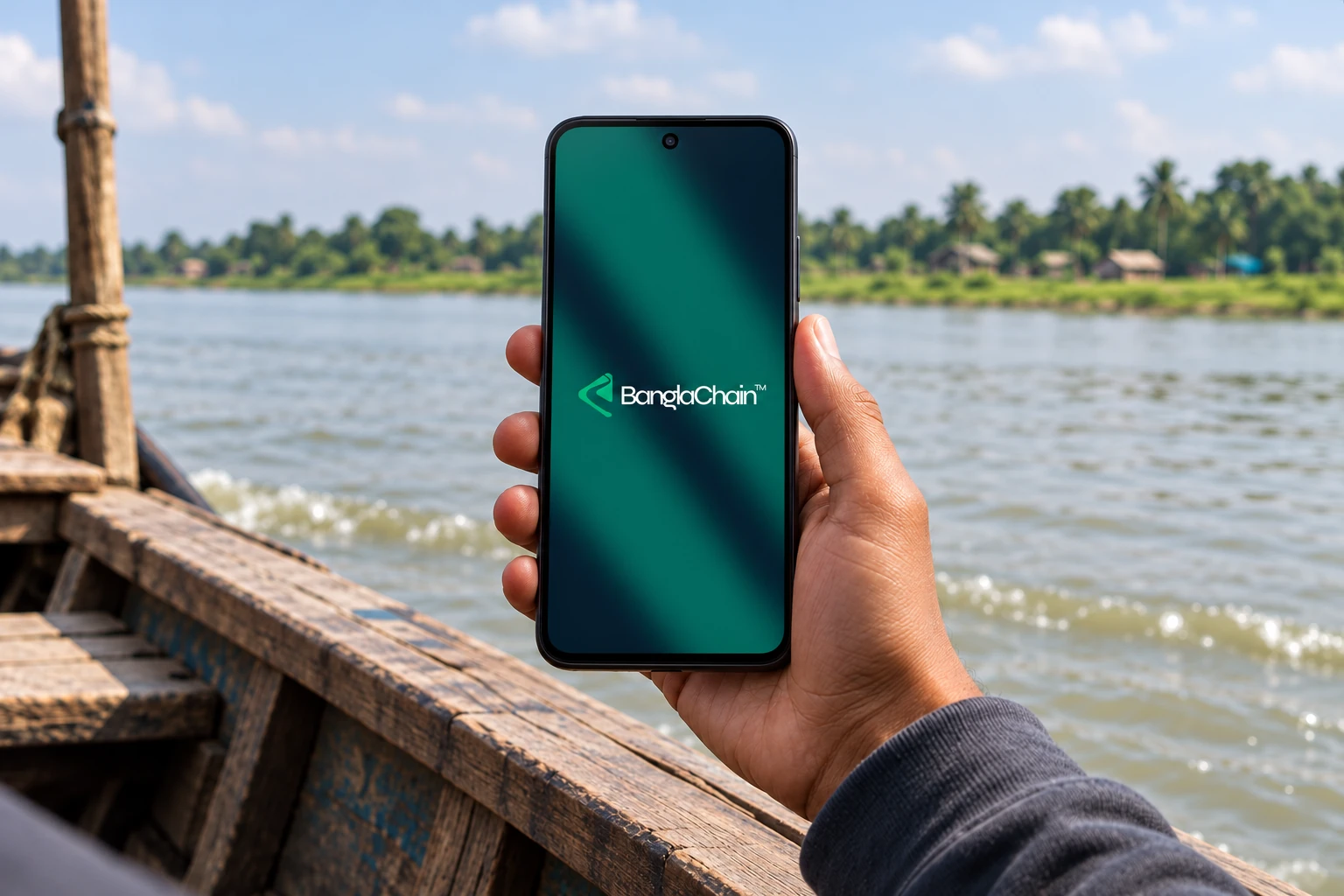
BanglaChain Foundation is a technology-driven nonprofit working toward an inclusive digital future for Bangladesh. The identity connects that ambition with the rivers that shape the country’s landscape, communities, and culture.
- Discipline
- Brand identity
- Year
- 2025
02 / The idea
It starts with a river.
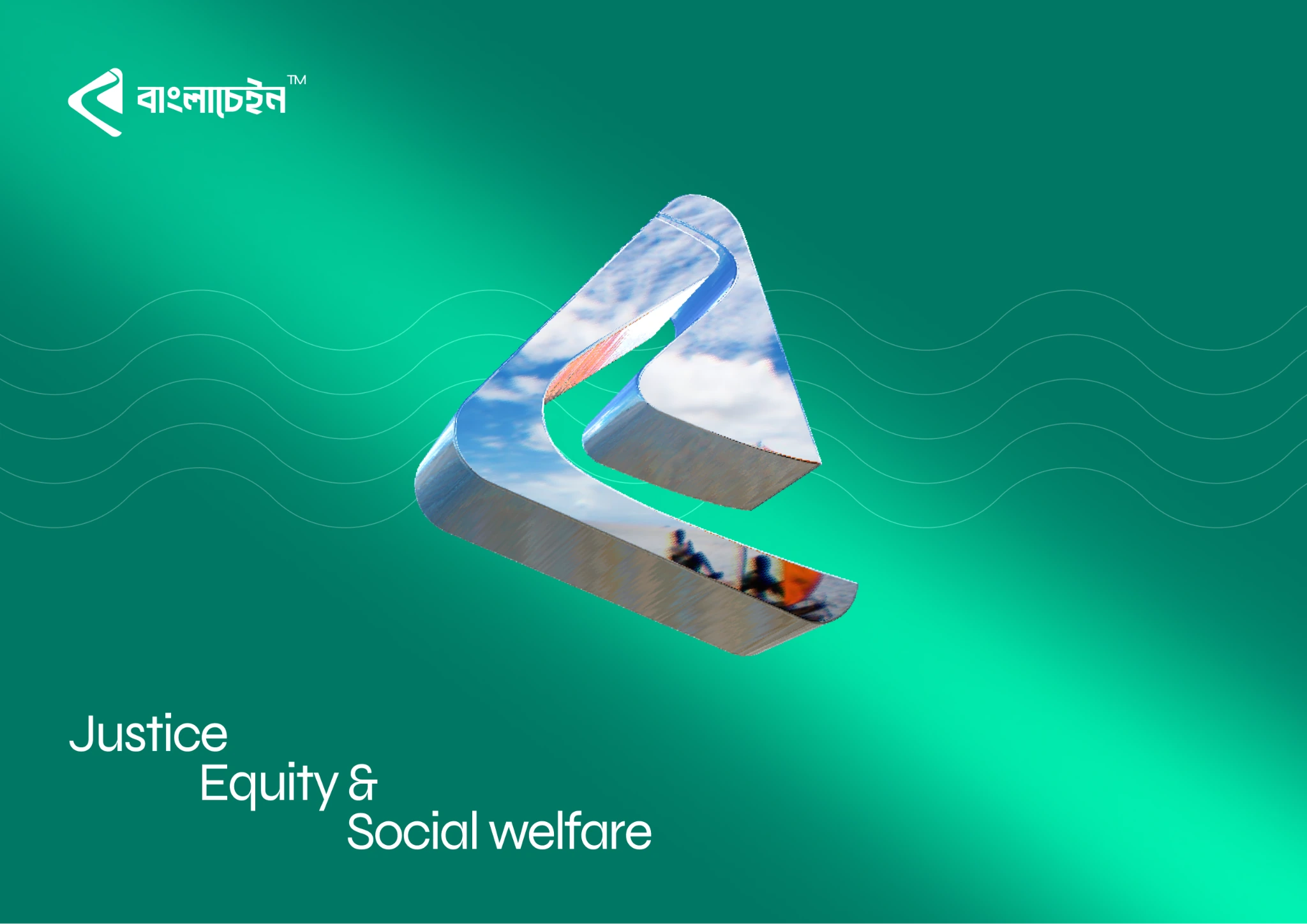
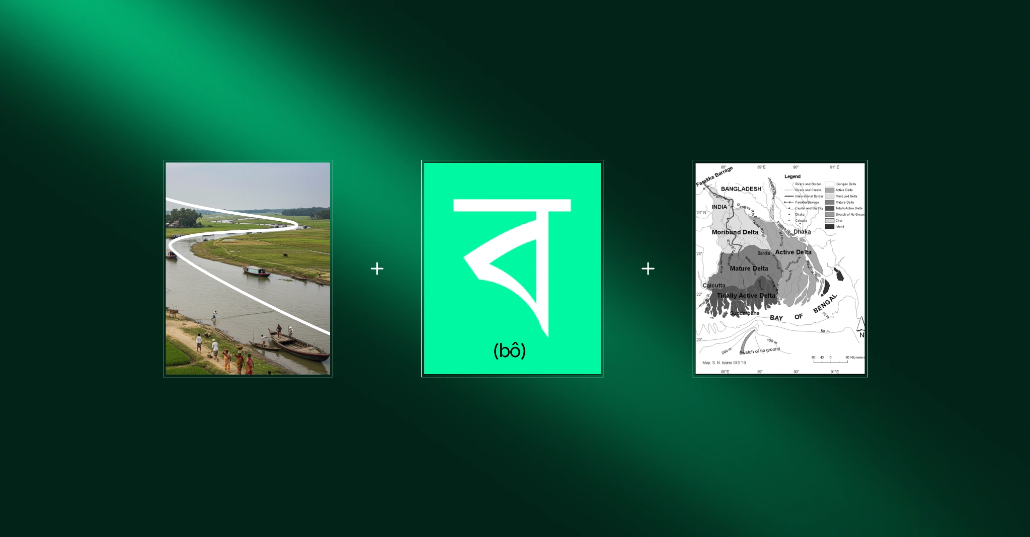
I wanted the identity to feel rooted in Bangladesh and relevant to a digital future. The river offered a connection between those ideas: it links places and people. Bringing that curve into the Bengali letter ব gives the symbol a local reference while keeping the form simple enough to carry the identity.
03 / The logo
One identity. Two languages.
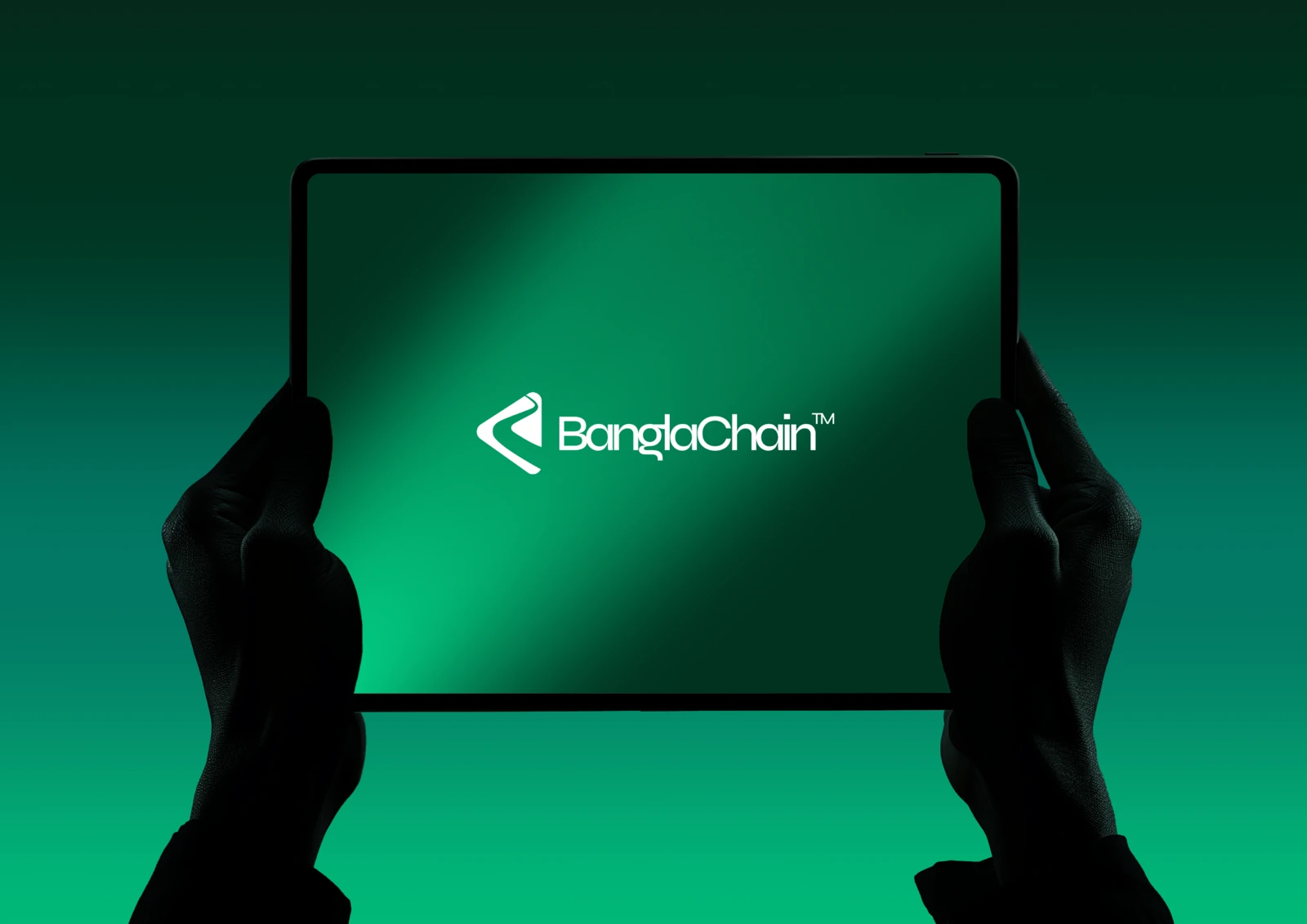
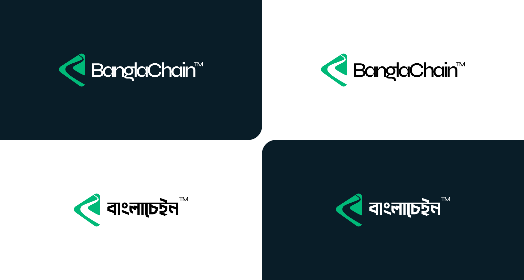
An inclusive identity needs to feel at home in Bengali as well as English. Giving both scripts their own wordmark lets each language retain its character. A shared symbol keeps the brand recognisable when the language changes.
04 / Graphic language
The river runs through it.
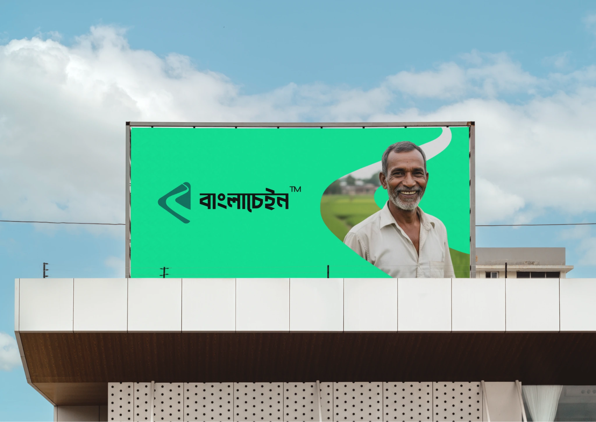
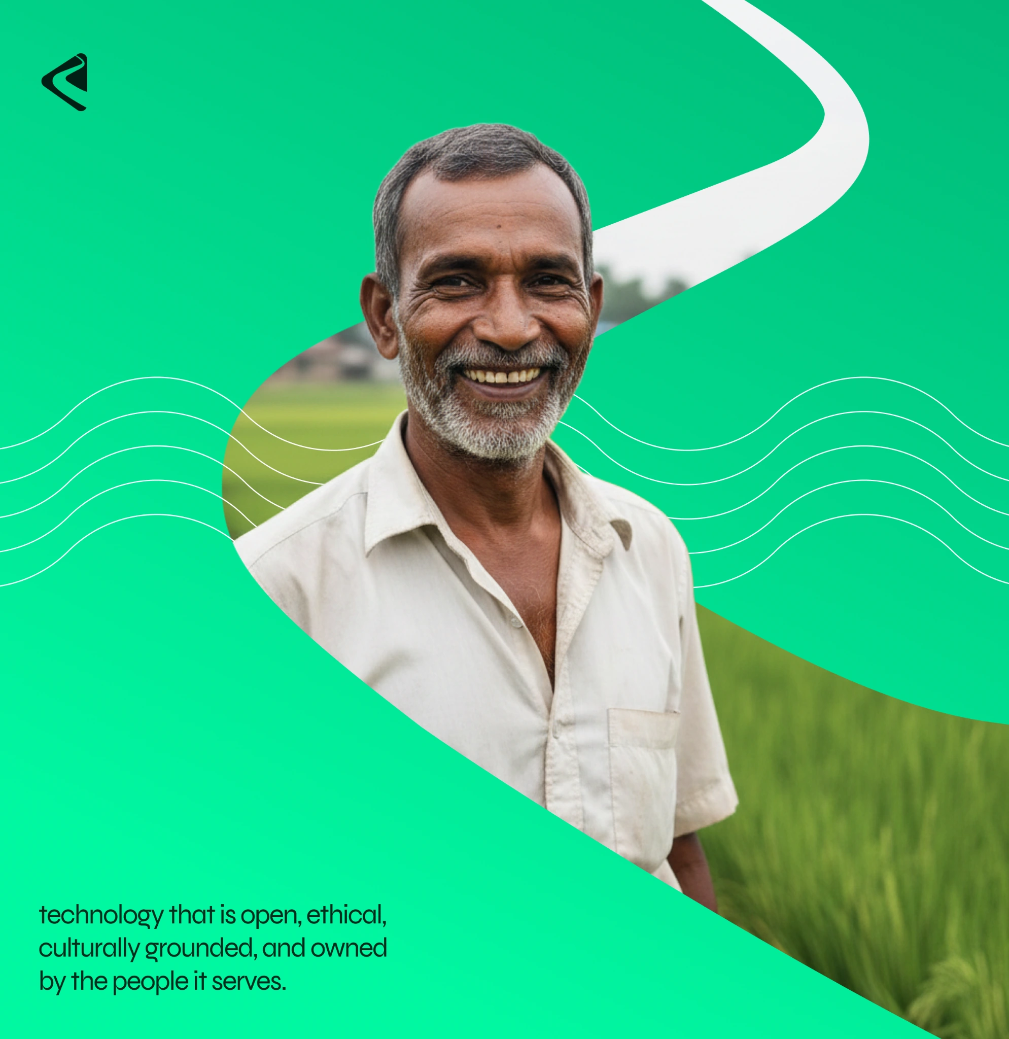
Extending the river curve beyond the logo gives the brand a recognisable way to communicate without repeating the full mark everywhere. Used as a frame, it makes room for people and their stories. The same form can adapt to different layouts while keeping them connected.
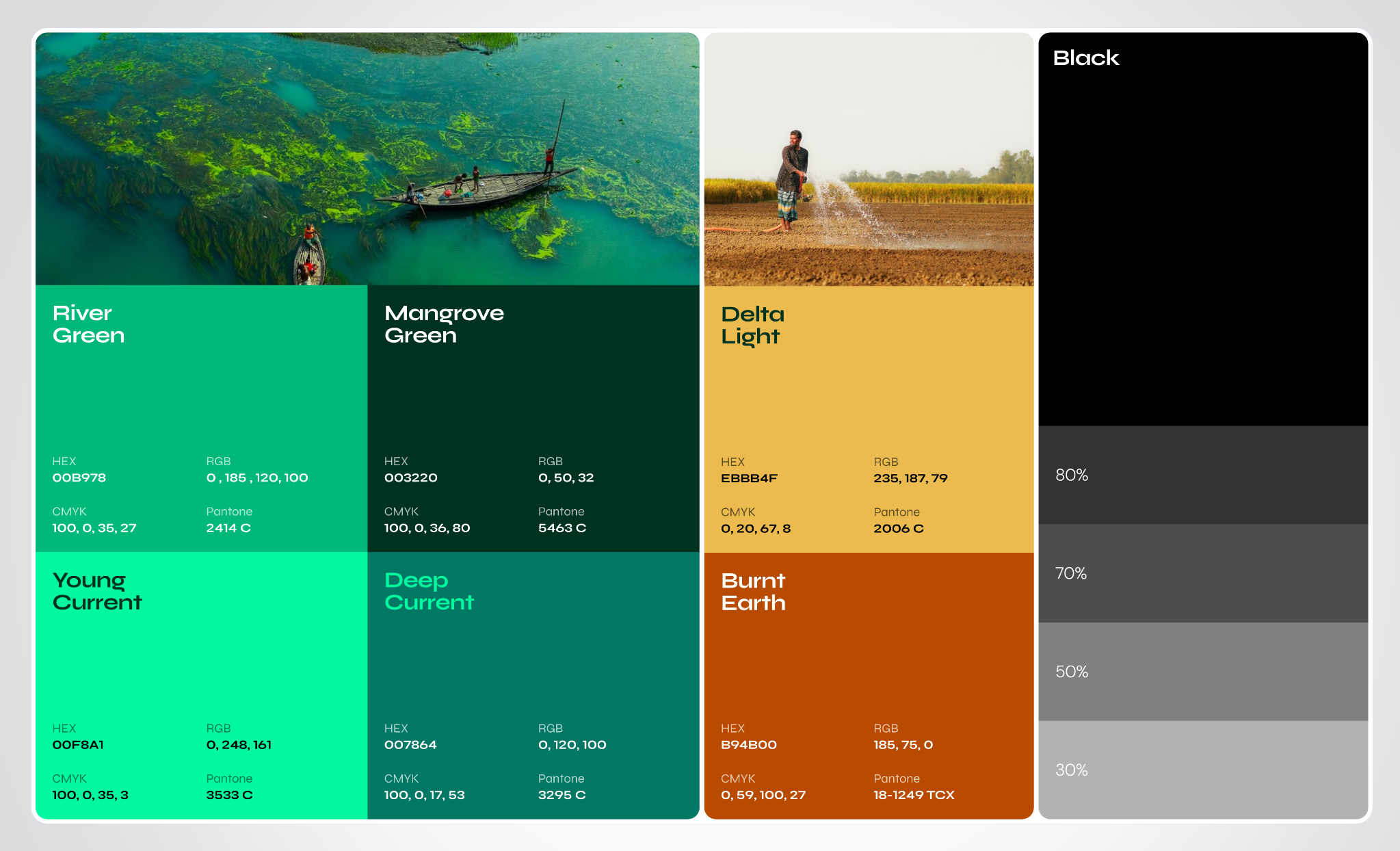
05 / Colour
A palette with a sense of place.
I drew the colours from Bangladesh’s landscape to keep the technology-led identity close to the place and people it represents. Green gives the system a clear centre; warmer earth tones soften the overall feel. The range of light and dark tones allows quieter layouts and bolder messages to belong to the same brand.